User Experience in Libraries: Insights from the University Library of Hildesheim
The aim of UX is not so much to be a state of affairs but much more to be part of a mindset; a skill which one can work on continually, even in libraries. Needs can change and even on the topic of UX, the following applies: Nothing remains for eternity. In an interview, Jarmo Schrader and Ninon Frank report on how they nevertheless manage to improve step-by-step the services and spaces at the University Library of Hildesheim.
An interview with Jarmo Schrader and Ninon Frank

It’s impossible to cover the many facets of User Experience (UX) in a single article. We are therefore approaching the topic with an international interview series that provides many examples from best practice, personal insights and tips for all those who would like to start with UX themselves: to the UX interview series.
Our guests today: Jarmo Schrader and Ninon Frank from the University Library of Hildesheim (German). Their insider tips:
- “you can go a long way simply with a smile and a friendly tone of voice”,
- first gather the “low hanging fruits” and
- then if you are not sure, simply give things a try and rearrange the furniture.
Their “Mission UX” started with an inspiring in-house workshop on the topic. Their methods range from guerrilla interviews to think-aloud tests and flip charts with a question that they would like their users to answer – their favourite method, by the way. In the interview they tell us why it is so important to supplement qualitative observations with quantitative methods, their three most important take-aways from 2.5 years of UX experience and why a red couch created a minor storm of indignation on their Facebook account.
Jarmo and Ninon, you work in the User Experience field at the University Library of Hildesheim. When and why did you start this? What does it mean in practice?
Jarmo: It was always important for us to offer a service that is oriented around our users. A workshop with the UX expert Andy Priestner, which I attended in spring 2019 was the starting point for our conscious exploration of the User Experience topic. I enjoyed the seminar so much that we invited him to an in-house workshop at the University Library of Hildesheim during the summer. The one and a half very intensive and fruitful days of the workshop ultimately formed the basis for our activities in the field of UX.
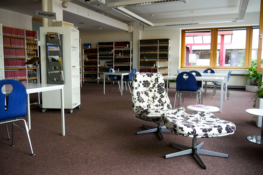
Ninon: The workshop provided the impetus for various projects. For example, we were wondering how we could make our reading room more attractive to users or how we could furnish an area, where magazine display cabinets used to stand, in such a way that it meets the needs of our users.
University Library of Hildesheim©
In practice this meant that we rearranged and then tested various furnishing scenarios as prototypes with the furniture that was available to us. We made it possible for the users to give feedback (mostly via a publicly displayed feedback form). However, we also measured the usage statistically, in order to be able to make a comparison between the statements made and the actual usage.
Ninon: It is our long-term goal to adapt our services and premises more towards the users, thereby achieving higher usage. However, needs are continually changing – it’s not as if we will ever have reached the stage where we can say: Things will stay like this for ever.
Jarmo: I also regard UX as being part of a mindset, a skill which one can continually work on and not necessarily a fixed objective that we must achieve.
Which UX methods are you using at the University Library of Hildesheim?
Ninon: During the workshop we learned about various methods. Since then, we have been doing guerrilla interviews as well as making observations. By “guerrilla interviews” we mean that we develop a small group of questions and then approach people in the library or on the campus with it. We also lay out feedback forms or set up flip charts for comments and notes.
Jarmo: The relaunch of our online catalogue HilKat was accompanied by UX methods. In the process we were greatly assisted by a student who carried out think-aloud tests via video conference in the context of his master’s thesis. Test persons solved various tasks in the new HilKat and “thought aloud” while doing so, so that we could understand where there were stumbling blocks in using the catalogue, which functions were popular, and which may not have been correctly understood.
Could you give us an example that worked in practice, where you used UX to solve a problem?
Jarmo: At the library we have a small reading room which is used far too little in our opinion. Based on our observations, we suspected that we could increase the attractiveness by using fewer but larger tables. We tested this theory by rearranging the furniture of half of the room and usage did actually increase; we also received positive feedback in accompanying surveys. Ultimately, a reduction of seats led to usage increases of between 25% to over 50%. A complete success!
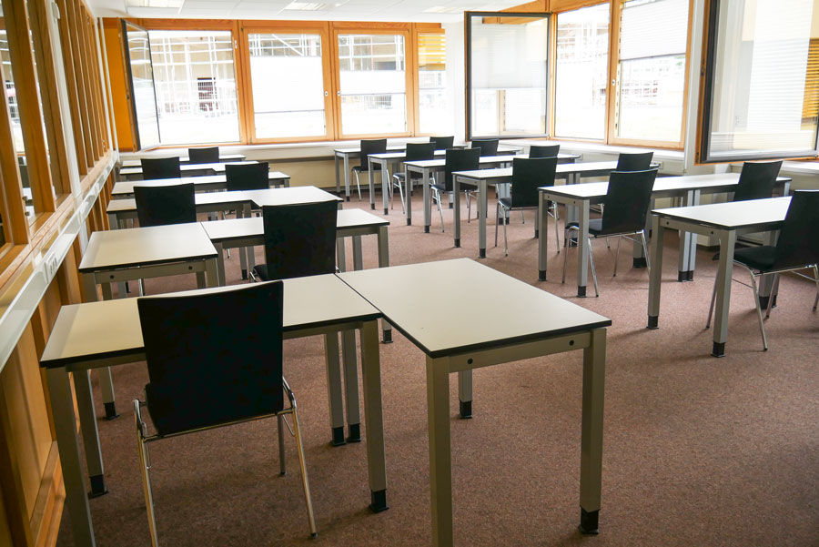
Reading room of the University Library of Hildesheim© after the redesign
Ninon: A further example was our idea to position mobile partitions between the tables so that users had more privacy. Our prototypes received very negative feedback in the feedback forms so we didn’t pursue this idea any further. And we actually saved money too.
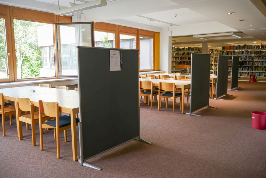
Mobile partition walls in the University Library of Hildesheim©
In order to use UX methods, it’s necessary to have library users who are prepared to participate. How do you manage to find and motivate these users?
Jarmo: As yet, we’ve limited ourselves to simpler methods which do not take up much of the users’ time, meaning that we didn’t have major problems here.
In our workshop with Andy Priestner we also tried out techniques such as interviews or cognitive maps and discovered that you can go a long way simply with a smile and a friendly tone of voice.
Ninon: Many users are amazingly willing to take part in such participation methods. We always receive feedback – especially when setting up flip charts with a question. This is really great!
What are – let’s say – the three most important lessons that you learned in applying User Experience methods at the University Library of Hildesheim?
- Just do it!
- You can always learn something from failures.
- Users don’t know what they want either. (They first have to be able to try it out.)
Have you also used methods that didn’t work at all? What were your biggest or funniest failures?
Ninon: We took up a request and experimented with allowing users to eat and drink in our reading lounge. For this, we removed the cosy furniture which was there to “chill out” on – including a red couch – to other places in the library, and put wipeable tables and chairs in its place. The feedback was: Yes, this is great but where on earth is the red couch?
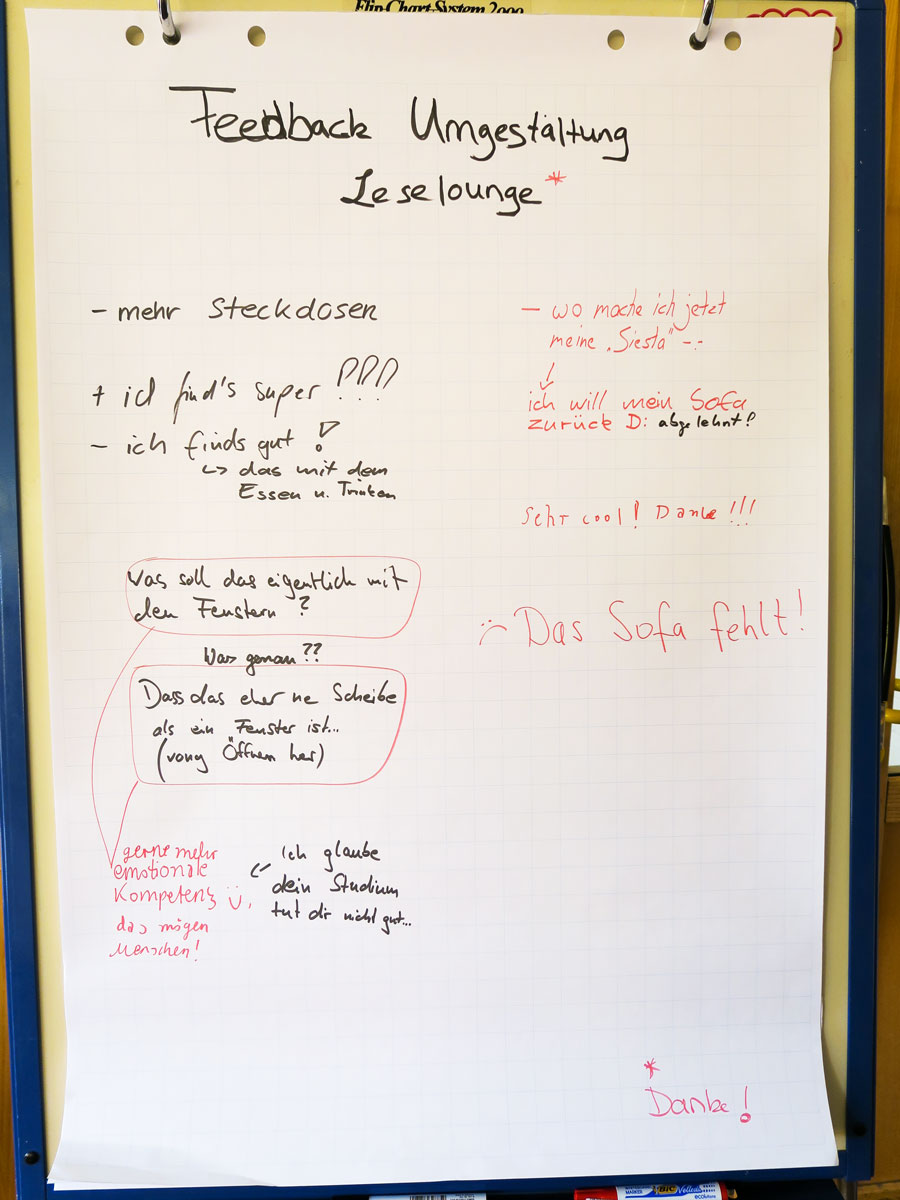
Feedback “”where’s the red couch?”” – University Library of Hildesheim©
Even on Facebook, where there had been very little response before, this absence was noted. We then brought the couch back, which was promptly rewarded with positive feedback.
What are your tips for libraries who want to begin with UX? What is a good starting point?
Jarmo: Start with the “low hanging fruits” – namely problem areas you already know about – and with changes that can be made with relatively little effort. Being successful here will then give you the required motivation to continue, and for these projects, simple UX methods are usually sufficient. You can save advanced techniques for later.
Our experience has also shown that you should supplement qualitative observations with quantitative methods, as otherwise there is a great risk that, filled with enthusiasm, you will only see what you want to see.
This text has been translated from German.
Read more about UX in libraries
- The Hashtags #libux, #uxlib and #uxlibs on Twitter are filled with active conversations and ideas about UX in libraries.
- Some of the experiences of the University Library of Hildesheim can be read here: Do They Really Know What They Need? Prototypes and Different Research Methods as a Means of Testing Students‘Feedback – A Case-Study
- User Experience in Libraries: Insights from the SLU University Library Sweden
- User Experience for Libraries: Insights from the University Library of the Cergy Paris University
- User Experience in Libraries: Insights from the Digital Finna Services at the National Library of Finland
- User Experience for Libraries: A Multi-site Approach at the University of Westminster
- User Experience in Libraries: Insights from the Library of the University of Amsterdam
- User Experience in Libraries: 4 Best Practice Examples from the ZBW
- User Experience for Libraries: The Best Tools and Methods for Beginners
We were talking to:
Dr Jarmo Schrader has been deputy head of the University Library of Hildesheim since 2008, where he is head of the IT department and supervises specialist units in the STEM area. He holds a doctorate in molecular biology and works mainly in the field of digital library services.
Portrait: Jarmo Schrader©, photographer: Isaias Witkowsk
Dr Ninon Franziska Frank is a subject librarian for education, social sciences and economics at University Library of Hildesheim and also works in the areas of public relations and information dissemination. Before becoming an academic librarian, she completed her doctorate in French literary studies in the Cotutelle procedure (a binational doctoral procedure) between the University of Erfurt and the Université de Paris Ouest Nanterre La Défense. She is particularly interested in insights into the needs of users.
Portrait: Ninon Franziska Frank©
Featured Image: University Library of Hildesheim©
View Comments

Open Science & Libraries 2022: 22 Tips for Conferences, Barcamps & Co.
Which conferences and events could be worth an (online) visit in 2022? We have put...
