User Experience in Libraries: 4 Best Practice Examples from the ZBW
Many people know that it is possible to deploy the methods of user experience in libraries, and know how to do this in theory. But how does this actually work in practice? And to what extent can it help libraries and infrastructure institutions develop their services? Nicole Clasen from the ZBW – Leibniz Information Centre for Economics presents four best practice examples to show us how this works.
by Nicole Clasen

Surveying users with and through user experience methods (UX methods) is now part of the regular repertoire for evaluation and further development of the user services of the ZBW – Leibniz Information Centre for Economics. Inspired by the participation of a colleague in an UX workshop, the ZBW started to apply UX methods in its libraries from 2016 onwards. Since then we have put UX methods on the agenda once a year, because we want to know more.
The UX projects take place at both ZBW locations (Kiel and Hamburg) and have a fixed objective. Only after fixing the objective, the colleagues do select the most suitable method for the implementation of the current UX project. Nicole Clasen leads these UX projects and today she introduces four of the most interesting surveys on the ZBW user services. You can find background information on the UX methods in a library context in the article: “User Experience for Libraries: The Best Tools and Methods for Beginners” .
UX in the ZBW: How we find users for the surveys
We define time windows in advance during which the usage is normally fairly high. As a small thank you gesture, sweets and small advertising gifts are organised. Then it is usually a question of using our powers of persuasion, and off we go. We have the best chances of success if the users are moving in the library. For example, if they are just arriving or getting themselves a coffee. Then they are surprised in a positive way that their opinion is sought – and happy to take part. The motivation to take part is understandably lower if they are sitting at their desk absorbed in work. It is also helpful if there is information about the planned campaign in advance via our newsletter.
UX best practice example 1:
EconBiz relaunch
In 2016 the EconBiz design was revised and, at the same time, the OPAC functionalities such as for example the order components for the local users, were integrated into EconBiz. EconBiz is the discovery system belonging to the ZBW. The portal offers supra-regional reference searches, free full texts and an event calendar.
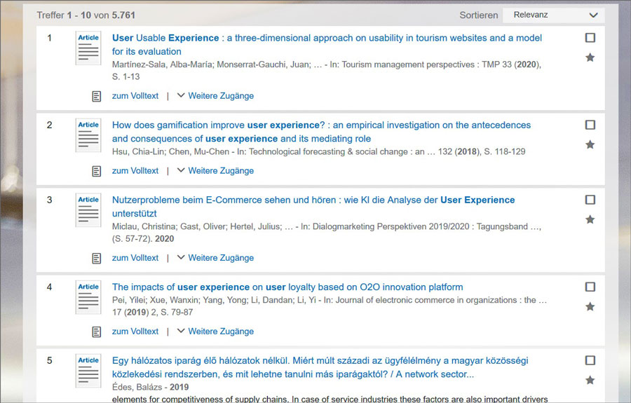
For the landing page and the hits display, several variants were possible. Each one was associated with a similar level of technical expenditure and with different advantages and disadvantages, respectively. After extensive discussions and pro- and contra-lists, the EconBiz project team decided to ask those people who did not have library-oriented or IT-induced blinkers and/or experiences – our users.
We developed test questions for the research and different order functionalities. We created the design suggestions as prototypes and made them available to those surveyed in the form of photos. The user services team took several samples at both locations and asked the users if they would take part. Questions were, for example:
- How do you look for xy?
- What do you think these icons mean?
- Which (hits) display do you like best?
In the practical implementation of the relaunch, the preferred alternatives were selected.
UX best practice example 2:
What do our users bring with them when they come here to study?
We asked this question in 2017. What do the users bring with them in the ZBW? Which local possibilities do they use regularly? In brief: What do they need and what would they like for studying?
We approached the topic with the help of the “What’s in your bag” method. In this method, you ask the users if you may look inside their bags and rucksacks. The objects are then grouped together and photographed. The fundamental assumption is that it would be service-oriented to have available those things that many people bring with them or to change something about the reason why they are bringing them. For example, make more plugs or a tasty coffee available, if many extension cables or thermos flasks are finding their way into the library.
In our case, it is not about the contents of the bag, but the workplace in the ZBW. The project team went through the reading rooms and group workrooms and asked for permission to take photos of the workplaces. The discussion then took place completely automatically and the explanations why this or that item was brought every day and why it would be great if the ZBW could offer emergency calculators, took place in a pleasant exchange of ideas.
The requirements and needs of one’s own workplace naturally differ; there were all types from minimalistic to full catering.
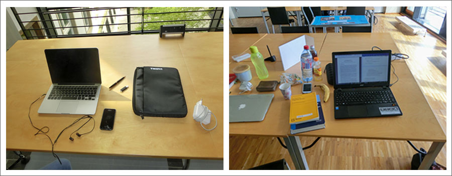
Despite this, common wishes and needs could be identified and clustered together. The fact that eating and drinking was allowed was popular with all participants. Electricity supply and WLAN coverage could still be improved. Smaller wishes such as an emergency calculator, which could be lent out when at a loss in the middle of calculating a complicated economic formula, or document holders, were easy and uncomplicated to implement.
Another result was that already existing services should be more strongly advertised, such as the security cable to lock notebooks and laptops.
UX best practice example 3:
The ideal place for studying
In the following survey round, we wanted to deepen the findings of the “What’s in your bag” study. The core question was therefore: What does the ideal studying location of our users look like? Our aim was to examine the preferences of studying locations, without limiting them to libraries. If users have the choice and prefer studying in the café round the corner or at home, then there would be something fundamentally lacking in the library.
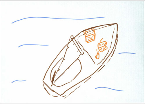
In this survey, the main points of focus were the (unconscious) preferences and wishes that users do not automatically connect with libraries. We wanted to ask the users for their creative ideas and suggestions for improvement. To do so, we selected the method of “cognitive mapping”. The motto: drawing instead of writing.
In cognitive mapping, the idea is to create a rough sketch on a particular topic. Users have a total of six minutes to do so. These are broken down into three time slots with one colour each used for two minutes. The choice of colours is insignificant.
Those surveyed featured the library strongly when drawing their favourite place of learning. We were unable to assess whether this would have been the case anyway, or whether it was due to the fact that the survey took place in a library.
Fundamental elements for everyone were an individual workplace and daylight. Book, pens, paper and laptop followed at similar percentages of 38% to 44% of those questioned. For around one third of all participants, coffee was definitely part of the ideal study condition. This will not necessarily justify the library and its coffee machines in some places, unfortunately.
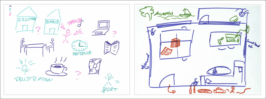
For a feeling of wellbeing, plants, fresh air, peace and quiet, music and a pleasant view were important in the cognitive maps. The good view was very often represented by a water view – both ZBW sites are located directly on water. It would be very interesting to compare this with a survey in central or southern Germany. Which library would like to give it a try?
UX best practice example 4:
A walk through the library
In 2019 we wanted to know the answers to some questions more precisely and asked our users if we could accompany them during their day in the ZBW (touchstone tour) to find out:
- What are their favourite places?
- Which walking routes do they take?
- What do they not understand or what things disturb them?
- And how do they perceive our typical library services and equipment?
We informed the users in advance in our newsletter, of course together with the information about which services have been improved or introduced in recent years, thanks to their participation in the UX surveys. Then it was time to select sample days and to approach the users: ready, set, go!.
The individual and group workplaces are the most intensively used, followed by the cafeteria at the Kiel location. The ZBW is a closed-stack library but the walking route of the users also leads past the pick-up shelves. At the same time, the lending rules seem like a little secret held by the user service that raises questions for the users. This issue needs to be improved.
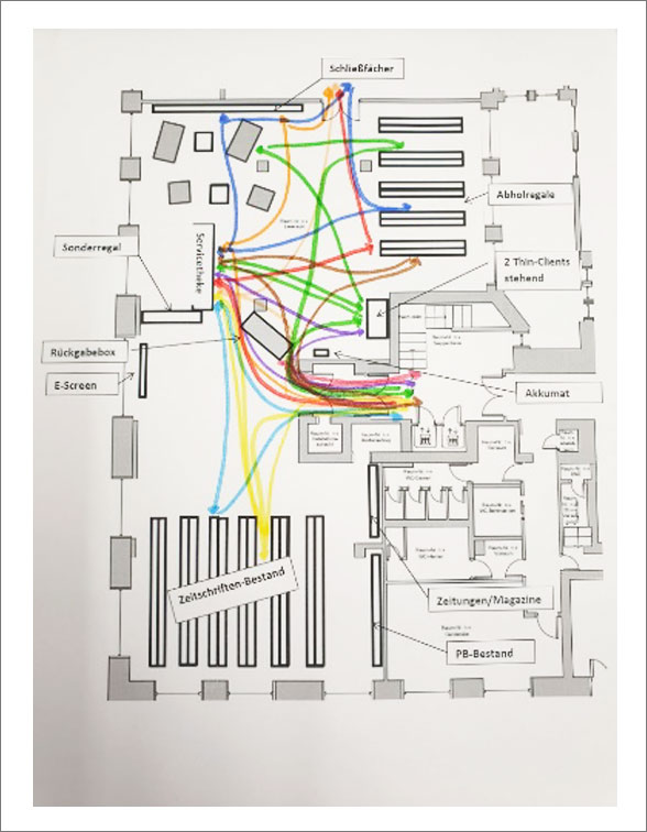
An important finding was that almost everyone has his or her very individual walking route through the library. This hardly changes or varies. Therefore, it is best to place new products or services in the middle of the walking route. Because people will notice them here. At the same time, information is perceived in the preferred manner and the other information routes are suppressed. User A reads the e-screen, user B reads the noticeboards and user C relies on the newsletter. This means that the most important information needs to be disseminated across all channels.
There is also a tendency for equipment to be used for a different purpose to that intended. The Akkumat is not used for its intended purpose of charging Smartphones and tablets but very often as an offline button according to the motto, “my Smartphone is off and I can learn in peace”.
The touchstone tours were particularly helpful in identifying services that were not being used. We were already aware that our cloakroom lockers were not intensively needed, but now we know very clearly that at least our sample users do not attach any importance to them.
Conclusion of five years of user experience in the ZBW
UX is so much fun! And not only for us but also for our users. The UX methods set offers numerous possibilities to recognise the wishes and needs of our users. These are often neither big nor fundamental changes but usually smaller things that make studying and working in the ZBW even more pleasant and give us a push in the right direction. The last five years have shown us that not only the surveys can be implemented by us independently and cheaply, but usually also the findings.
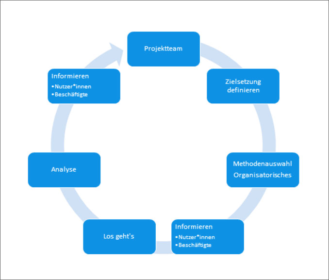
Yet the extent of the preparatory and follow-up work should not be underestimated. Every survey needs to be evaluated, the wishes ranked and an implementation strategy developed. Users do not expect all suggestions to be implemented immediately. Nevertheless, obviously they would also like to have information about what will happen, and what will not. You also need to plan time for this process. And then everyone looks forward to the next round of UX methods on our agenda.
Have we aroused your curiosity? Would you like to try out UX? Go for it! Pluck up the courage to tell us of your experiences! Share them with us on Facebook or Twitter!
This might also interest you:
- Podcast with Nicole Clasen: Experience the digital library .
- User Experience for Libraries: The Best Tools and Methods for Beginners.
- Open – The ZBW Annual Review 2019 (PDF), p. 26, p. 43 (German).
- User Experience in Libraries: Insights from the Library of the University of Amsterdam.
- Libraries as a Place after Corona: Hybrid and Participatory?
View Comments
Digital Badges: Clever Proof of Information Literacy
Libraries and digital infrastructure facilities are increasingly responsible for the...
