Research Data Management: Over-Reliance on the Lifecycle Metaphor – and Alternatives
The metaphors we use have an impact on our perception of the world. Thus, how you think of and how you represent research data influences the way you see related processes and possibilities in research data management. In his guest blog post, Andrew Cox describes the dominance of the lifecycle metaphor and alternative metaphors.
by Andrew Cox
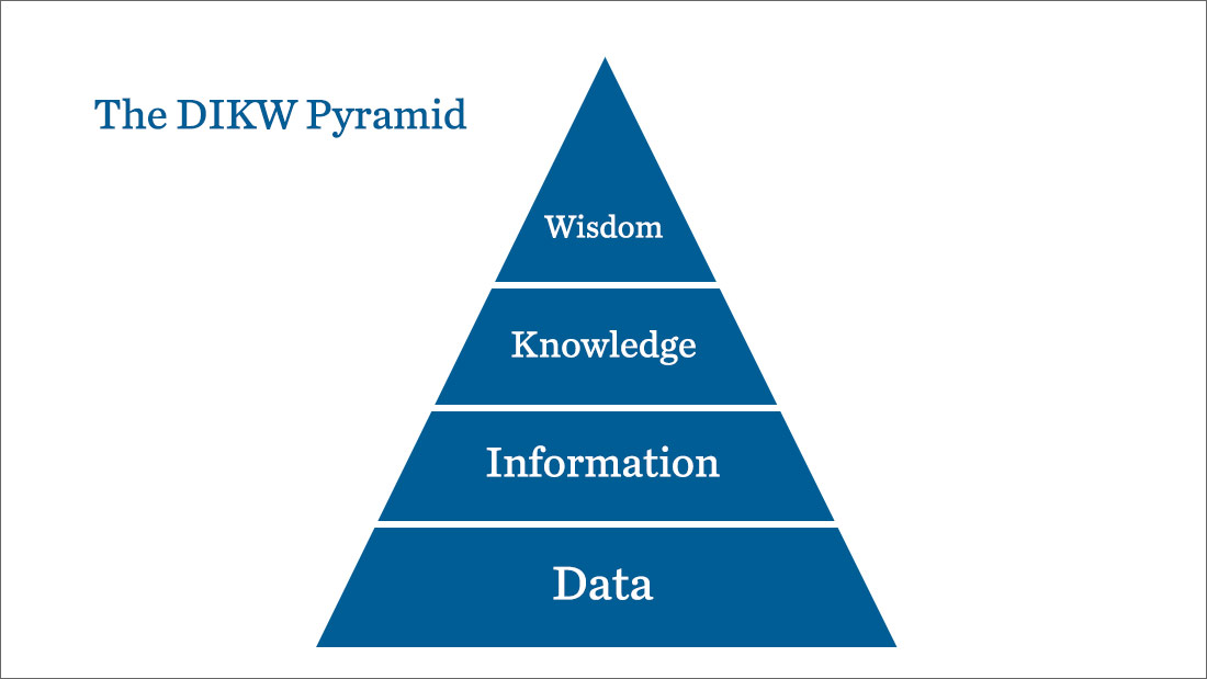
A few years ago, if asked to represent data we would probably have immediately thought of the pyramid model: with data lying at the base of the pyramid and information, knowledge and wisdom laid out above it.

This visualisation is based on the idea that a mass of “raw” data is the foundation from which different levels of understanding are successively refined.
Another important metaphor and visualisation is the store or repository. This represents data as captured, stored, used, managed and preserved. It is based on the idea of data as static and basing services on or around it. It focuses on maintaining integrity of data, granted that in the context of changing technologies maintaining integrity itself implies some change.
The OAIS model, page 4 – 1 (PDF) is the classic version of this model in the research data context.
The metaphor of the lifecycle
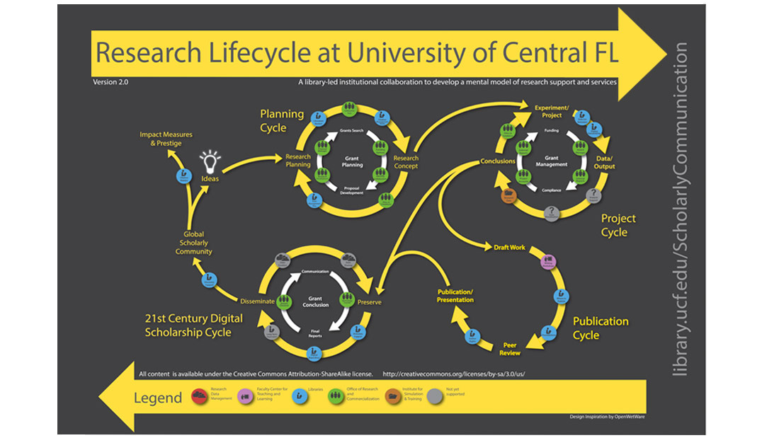
But in the last few years thinking about research and research data seems to have become dominated by the metaphor of the lifecycle. Indeed, models of research, research data, data curation, support services all seem to be represented in this form.
Here are just a few notable examples:
- University of Central Florida Libraries: Overview Research Lifecycle
- UK Data Service: Research Data Lifecycle: Publishing and sharing data
- Digital Curation Centre: DCC curation lifecycle model
- Research Lifecycle enhanced by an “Open Science by Default Workflow”
- Berkeley Library: UC Berkeley publishing lifecycle
There are some good reasons for the popularity of the lifecycle metaphor. It is simple and immediately understandable.

It critically focuses and helps to identify vital moments of movement and change in data and also points when we can intervene with services and new systems. In the context of the complexity of research workflows this focus on process is key. In particular, one concept of the lifecycle implies a rebirth or reuse: with our stress on the potential of reuse. The lifecycle concept has always been a key metaphor in archival theory.
Reliance on one metaphor is dangerous
However there are some drawbacks to the lifecycle metaphor and visualisation. Firstly, it is ambiguous whether it is a lifecycle of birth to death or a cycle of renewal. Often circular representations imply the latter, even if there is no identification of any process through which this might happen. More significantly, reliance on one metaphor is always dangerous; especially when we start to forget that it is just a metaphor.
Thus it is worth thinking of other metaphors and visualisations that could open up new perspectives on research data. Here are a few thoughts about alternatives:
- The upward spiral: This implies accumulating understanding based on analysing data in different ways and data being combined in new ways. In a way it is a more dynamic version of the pyramid and combined with the lifecycle.
- The declining curve: This represents the declining use, value or even meaning of data over time. This visualisation prompts us to think about how far data value can be maintained, or whether investment in long term preservation is cost effective, if its value is declining. A good example of this can be found in the paper: Michener, W.K., Brunt, J.W., Helly, J.J., Kirchner, T.B., & Stafford, S.G. (1997). Nongeospatial metadata for the ecological sciences. Ecological Applications, 7(1), 330-342.
- The network: This maps out the relation between data sources and publications and or authors. This would help us identify datasets that are particularly seminal or underused, as well as to chart the links and gaps between users of data in different areas of study. By reconstructing a time lapse of the network we can observe how connections are built. This kind of visualisation makes us more aware of which data sources are most used and which seem to be underused. It prompts us to think how such gaps are created (are they less visible?) and how they can be addressed.
- The data journey: This prompts us to think about the “movements” of a data collection across different domains of its creation, use and preservation. It would include different forms of organisation such as research bodies, subject communities, data centres, funders, commercial users of data and publics and charts data movement or sharing between them. It reminds us of the processes of reinterpretation and change in data as it “moves” across boundaries between domains. It can help us pin point hubs of use and cross boundary mediators. This kind of representation focuses our attention on the changing meaning of data as it moves across different spheres of activity. What sort of scaffolding needs to be put in place to help users in different domains understand each others’ interpretations? (See Bates, J., Lin, Y. W., & Goodale, P. (2016). Data journeys: Capturing the socio-material constitution of data objects and flows. Big Data & Society, 3(2), 2053951716654502).
- The rich picture: This would map out even more entities, including data, publications, authors and organisations but could include any other entity that was relevant. It would also map different forms of process connecting these entities, and also identify boundaries and mark points of conflict. The rich picture visualises the complexity of lives of data in one particular social world. This kind of representation brings home the importance of understanding the broad social world within which data is being used.
Rethink our over-reliance on the lifecycle model
This listing is surely not comprehensive. There are many other visualisations that could help us think about data in different ways. Hybrid models drawing on more than one type of visualisation could certainly also be useful.
I hope this blog entry prompts the reader to rethink our over-reliance on the lifecycle model. And if you want to reflect further about this, you might want to read our paper.
Cox, AM and Tam, WWT (2018) “A critical analysis of lifecycle models of the research process and research data management”, Aslib Journal of Information Management, 70 (2), 142-157.
View Comments

IFLA Global Vision Report: Library Core Values Boost Open Science
The IFLA Global Vision Report answers questions like: What professional values do...


